

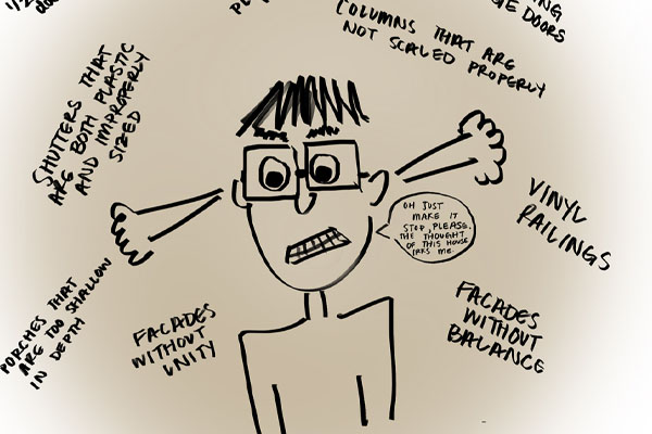
Architectural Pet Peeves
Ten things that will irk an architect
At Bohl Architects, we strive to create spaces of pure delight for our clients in which all elements-massing, materials, doors, windows, etc., create a harmonious composition in which some elements are emphasized while others are simplified. Here are our Top Ten Architectural Pet Peeves of things that we find purely dreadful:

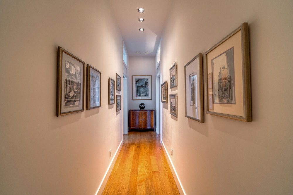
10. Halls that end in blank walls – If a window is not possible to expand the hall visually to the outdoors, place a mirror or artwork with a perspective as a focal point.
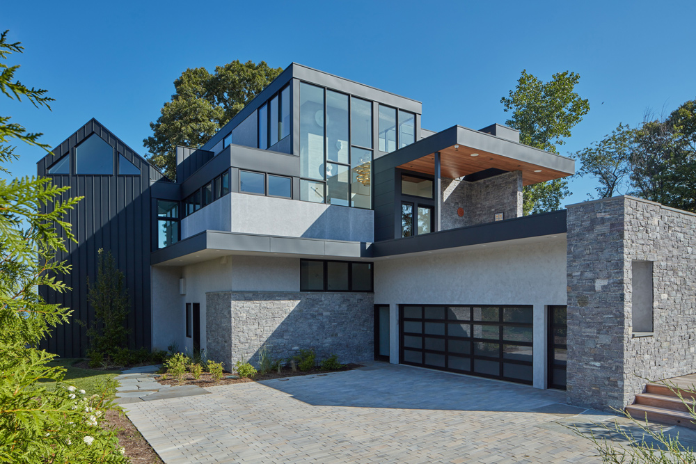
9. Front facing garage doors. They should never be the primary feature of the front elevation. If the doors must be located there, set the garage back at least 18 feet from the rest of the house to minimize its presence. A fence and pergola could be added for further camouflage.
8. Plastic Window Muntins- They rarely fit properly and they look cheap. This is a venal sin. Period.
7. Incorrectly Sized Transoms: The proper proportion is to match the height of the transom panes with the height of the window’s glass panes below.
6. Shutters that are both plastic and improperly sized: The width should be half of the window opening since the shutter’s original function was to close off the window opening to the heat of the day or from storms. PVC or wood shutters are best.
5. Vinyl railings – Attachments such as railing to building wall are clumsy and feel unstable. If wood is not an option, PVC is a better choice and its weight makes it more secure than hollow vinyl.
4. Columns that are not scaled properly: The rule of thumb is for every inch of height, the column diameter needs to increase 1” in diameter. Having said that, oversize columns are perfect for quirky craftsman houses that we all love.
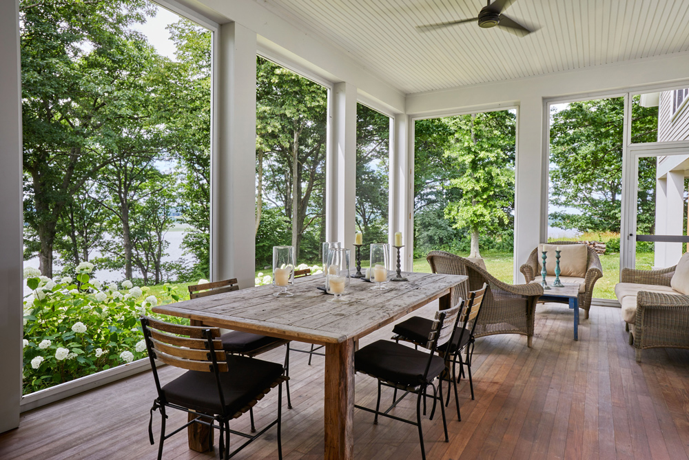
3. Porches that are too shallow in depth: Too many spec houses have very shallow front porches. The porch depth should be a minimum of eight feet, but ten is better. Porches are great “outdoor rooms” and need to be sized for both seating and circulation space.
2. Facades without unity- An odd number of bays is more pleasing to the eye since the rhythm is then dynamic and not static. Window and door openings should be between 15% and 35% of the wall to achieve a pleasing aesthetic with ample daylight.
1. Facades without balance: Scale, proportion, symmetry or asymmetry, light and shadow, pattern, texture and color create a harmonious relationship between all the parts of a building. Proper balance is obvious in a symmetrical façade but it even more important in an asymmetrical façade.
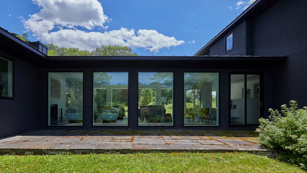
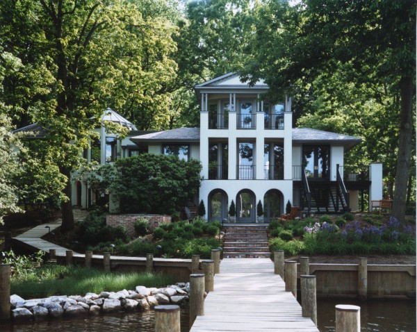
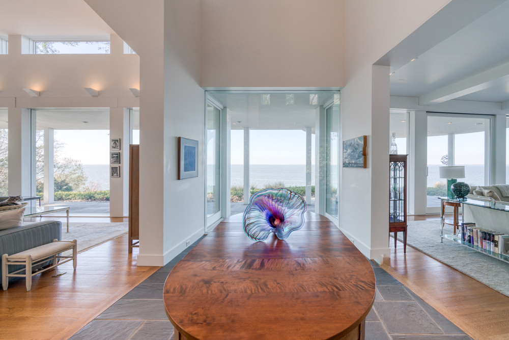
Check out the photos below to see what you can do to avoid annoying the architect community. And if one of these peeves sounds like your home…don’t worry, we still love you. And we’re happy to do renovations.
Avoid #10 and make sure you have windows or artwork at the end of the hall.
Avoid #9 and face those good ole garage doors to the side of the house.

Avoid #3 and do yourself and your guests a solid by making that porch nice and spacious.
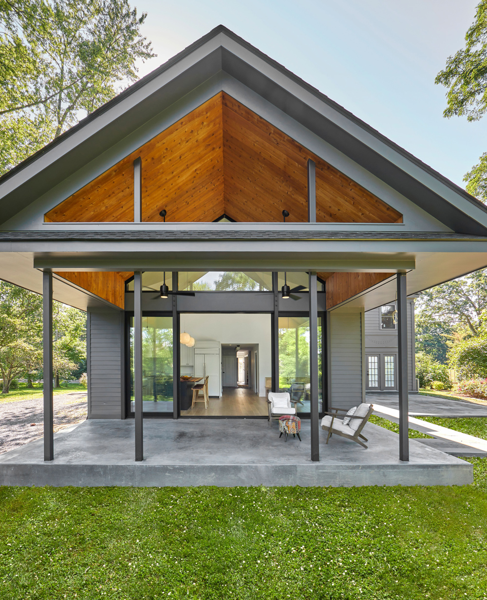
Avoid #1 and just balance that façade.